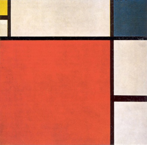
Following the devastation of the First World War, Dutch artists Piet Mondrian and Theo van Doesburg founded de Stijl (The Style), a utopian art movement intended to create works of art that communicated spiritual harmony. Both artists were Theosophists and therefore were dedicated to expressing a universal cosmic order with their art. Mondrian thought this was best done in paintings that have dynamically related line and color. He used primary colors (blue, red, and yellow), values (black and white), and directions (horizontal and vertical) and arranged them on his canvas in asymmetrical, yet perfectly harmonious and balanced compositions.
Mondrian intended to move a viewer’s soul with his clear, clean, and balanced compositions. He believed that his paintings could assist a viewer in conceptualizing the spiritual realm, which, according to Theosophists, existed outside of time and space.
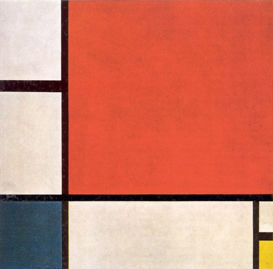
The best way to appreciate the perfect balance in Mondrian’s paintings is to view one upside down (see below). In this example, the red square, which is balanced beautifully by the bright yellow rectangle and flat blue square when oriented properly, now pulls the composition down toward the left, weighing heavily. The yellow has lost its effectiveness, and the blue does not have the same functionality and therefore appears as an afterthought.
 Inverted: Piet Mondrian, Composition with Red, Blue, and Yellow, 1930, oil on canvas, 20” x 20”, Collection of Kunsthaus Zurich, Photo by William Cromar under a Creative Commons Attribution License.
More paintings by Piet Mondrian
[nggallery id=14]
Recommended Reading

